418 West 25th Street: Loft25, Chelsea, NYC
how to brand a large complex with a diminutive addition
Location: Chelsea, New York City, 2010 Size: 9 Stories, 120,000 SF, 79 Units
Type: Loft Building Renovation, Adaptive reuse (from Printing Facility to Residential), New Building Addition and Interiors
TRA studio’s Assistance: Architectural Design + Documentation, Interior design, FFE, Lighting, Branding and Logo Design.
Design Collaborator: CDA, Cangelosi Design Architecture
Loft 25, Chelsea, NYC
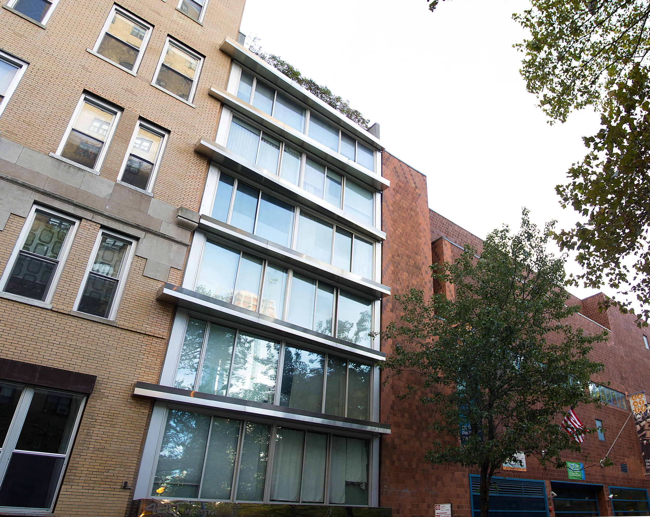
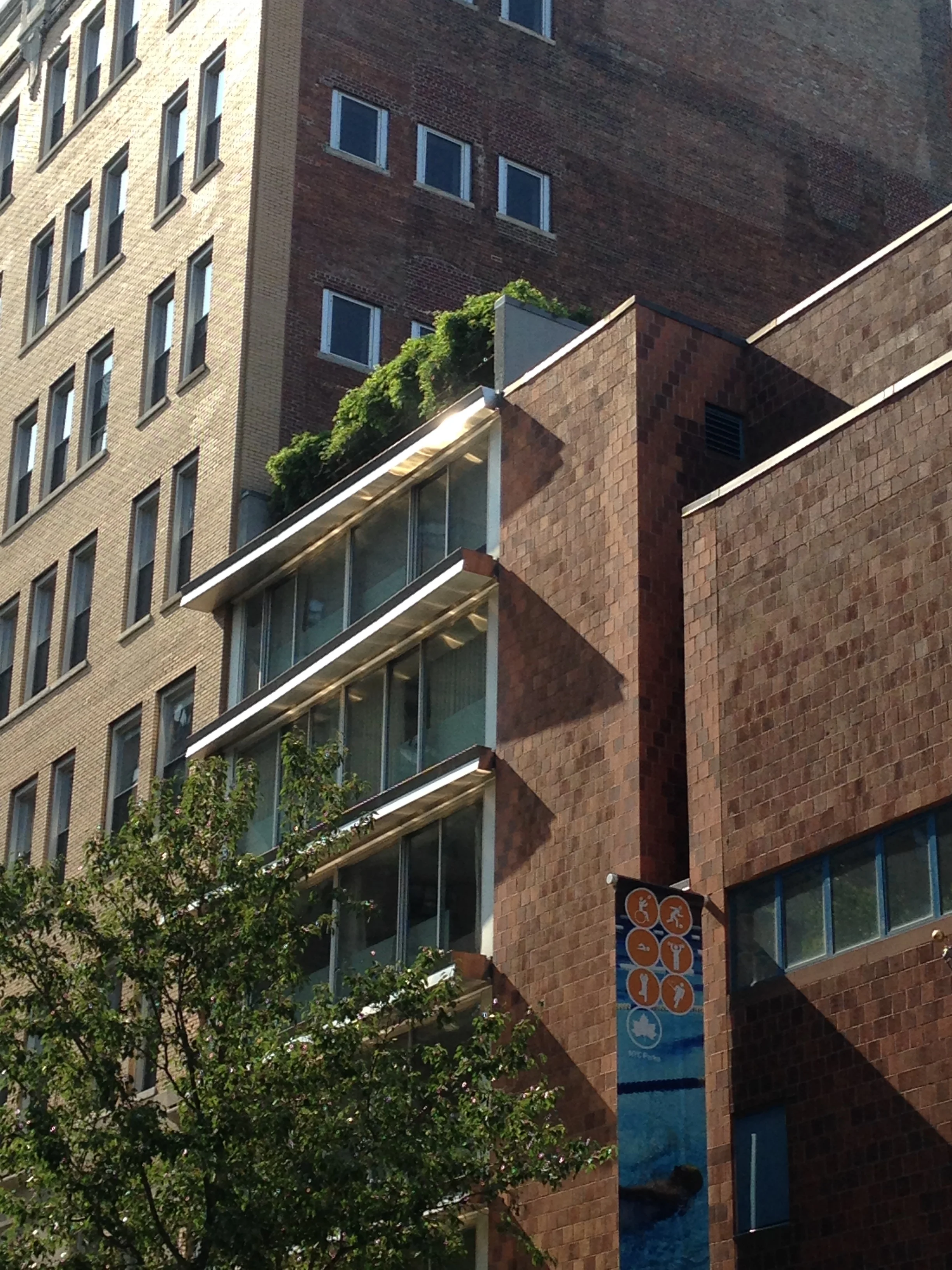
A simple gesture provides the unifying element between the loft building and the new addition, providing also the branding for the project.
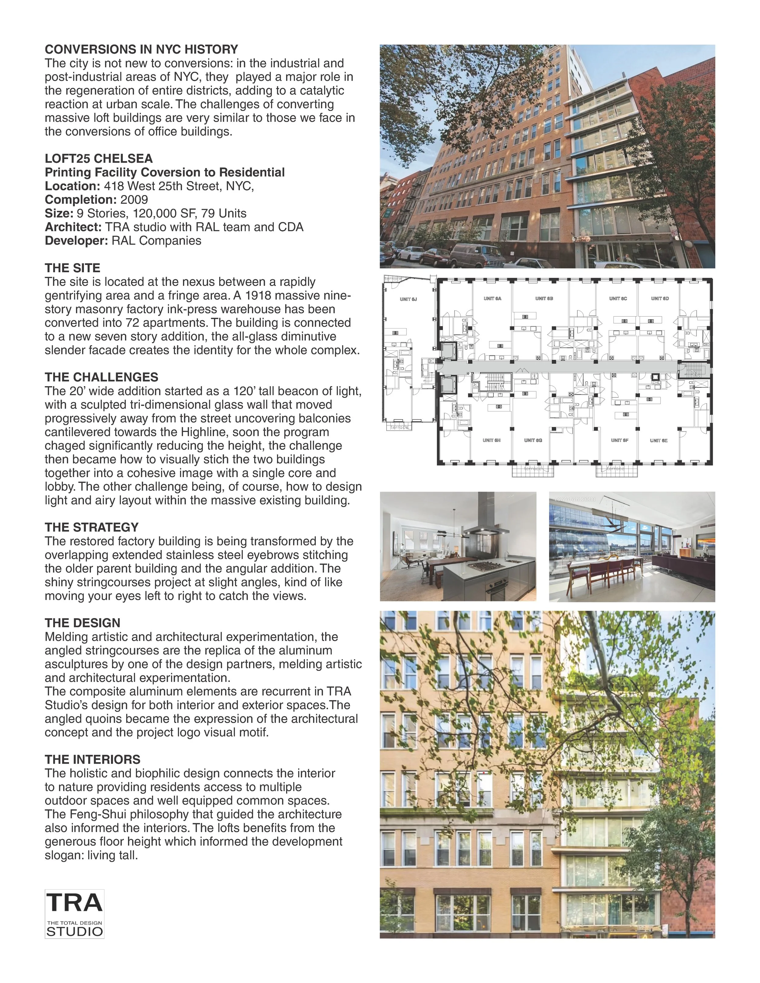
LOFT25 CHELSEA , 418 West 25th Street, NYC,
Size: 9 Stories, 120,000 SF, 79 Units, 2009
Printing Facility Coversion to Residential
ARCHITECT: TRA studio with RAL team and CDA
HISTORY OF CONVERSIONS IN NYC
The city is not new to conversions: in the industrial and post-industrial areas of NY City, they have been the catalyst for the regeneration of entire districts,/THE SITE
The site is located at the nexus between of what a rapidly gentrifying area and a fringe area.
A 1918 massive masonry nine-story masonry factory ink-press warehouse has been converted into 72 apartments. The building is connected to a new seven story addition, the all-glass diminutive slender facade creates the identity for the whole complex.
THE CHALLENGES
A massive masonry nine-storey masonry factory building used for printing is converted into 79 apartments. The building is connected to a new addition housing nine apartments, which creates the identity for the whole complex with this narrow structure.
The 20’ wide addition started as a 120’ tall beacon of light, with a sculpted tri-dimensional glass wall that moved progressively away from the street uncovering balconies cantilevered towards the Highline. The balconies increased in depth with the rising levels, similarly to the Singer Building. Soon the program changed significantly reducing the height, the challenge then became how to visually stich the two buildings together into a cohesive image and physically with a single core and lobby. The other challenge being, of course, how to design a light and airy layout within the massive existing building.
THE STRATEGY
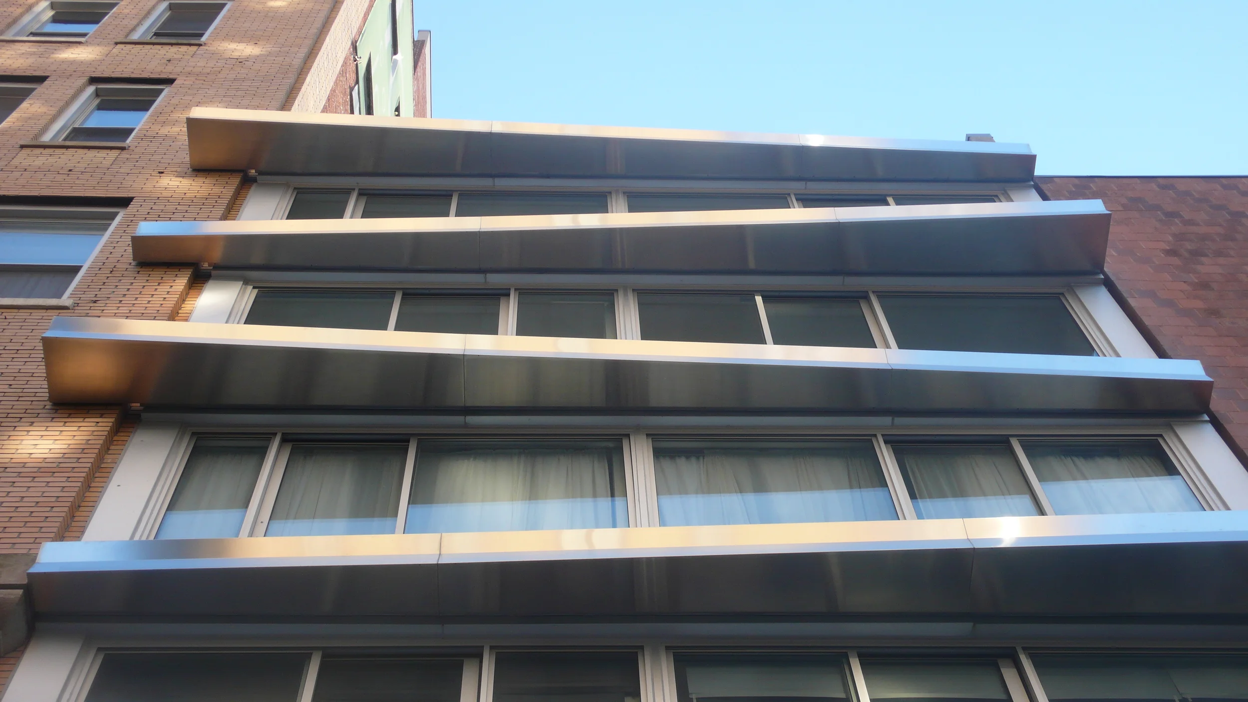
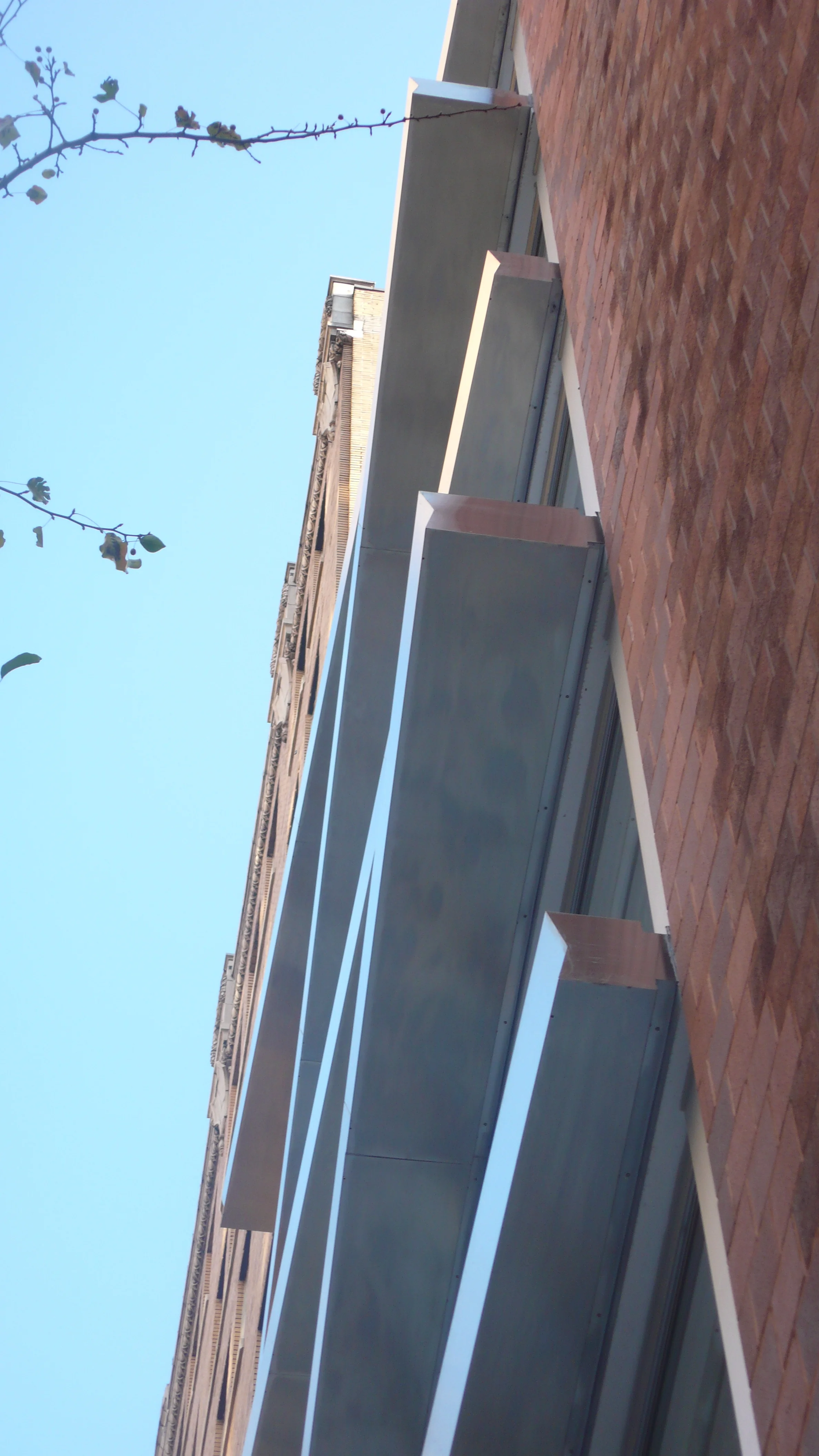
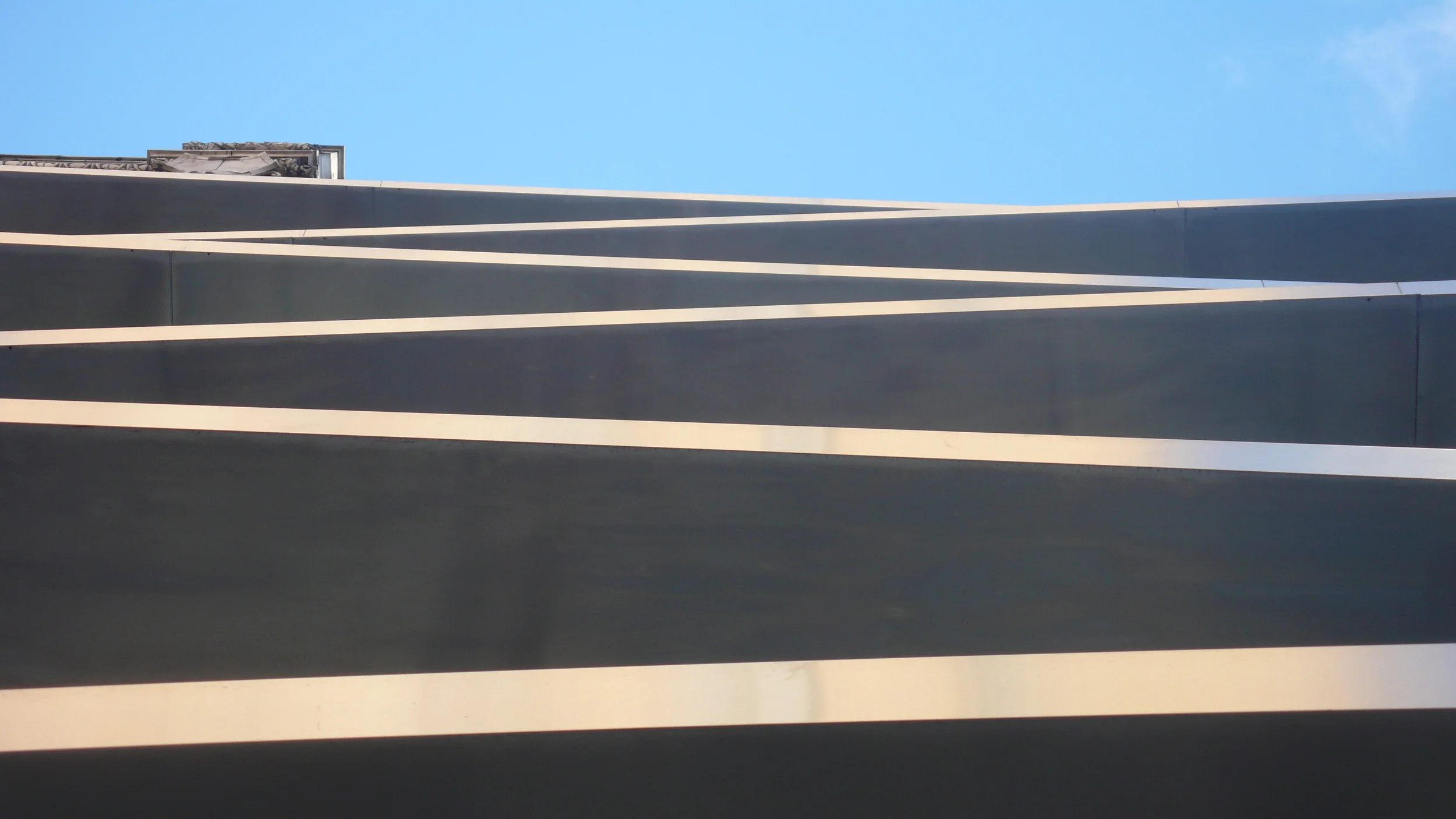
The restored factory building is being transformed by the overlapping extended stainless steel eyebrows stitching the older parent building and the angular addition. The shiny stringcourses project at slight angles, kind of like moving your eyes left to right to catch the views.
THE DESIGN
Melding artistic and architectural experimentation, the angled stringcourses are the replica of the aluminum backdrops of the “minimal pours” by one of the design partners who is also a gestural artist.
The sculptural paintings, hanging in our studio the day we were looking for a solution to the design problem, became the expression of the architectural concept and the project logo visual motif, melding artistic and architectural experimentation.
The composite aluminum elements are recurrent in TRA studio’s design for both interior and exterior spaces.
The angled quoins became the expression of the architectural concept and the project logo visual motif.
THE INTERIORS`
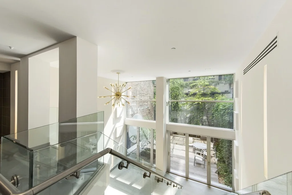
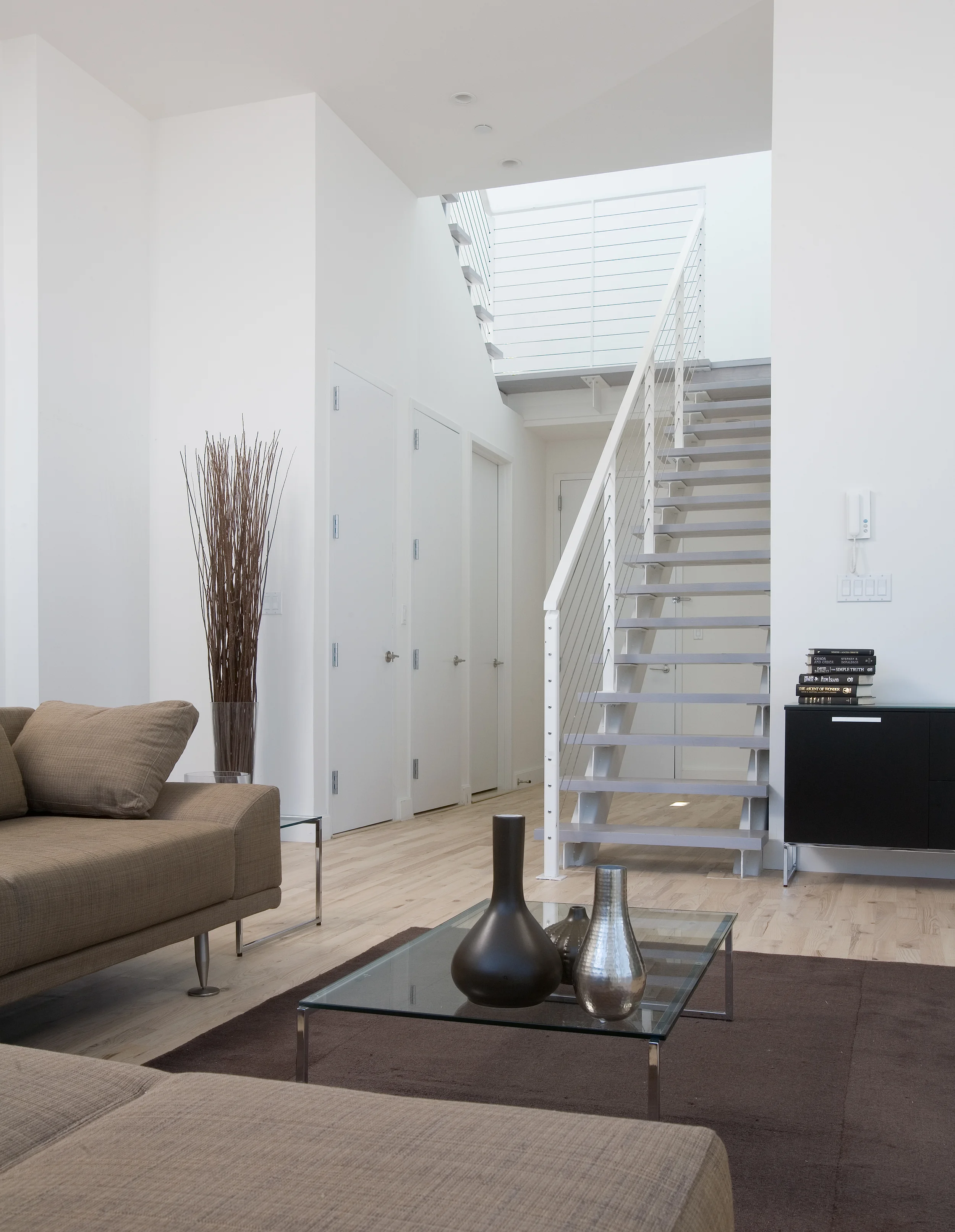
The holistic and biophilic design connects the interior to nature providing residents access to multiple outdoor spaces and well equipped common spaces.. The Feng-Shui philosophy that guided the building architecture also informed the interior design. The lofts benefits from the generous floor height which informed the development slogan: living tall. Both the loft apartments an dthe smaller new units recorded great sale as well as re-sale prices.
THE OUTDOOR SPACES
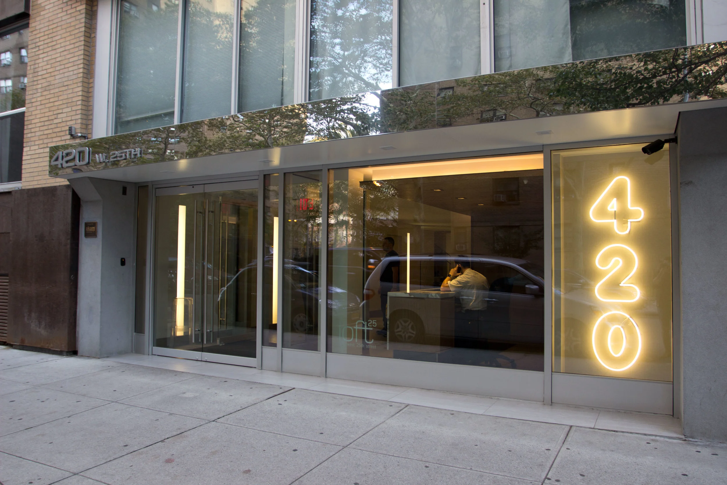
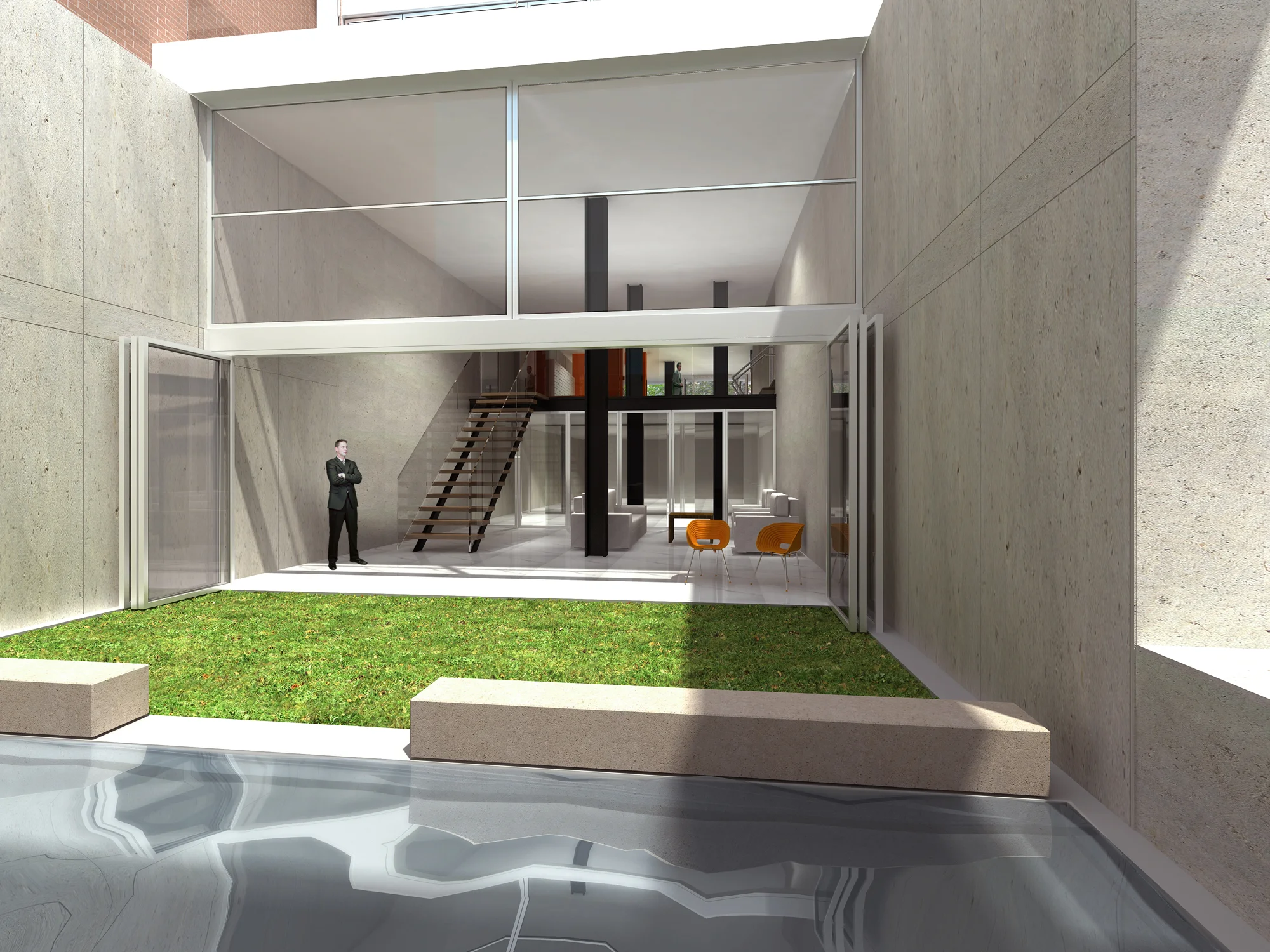
The lobby entrance and Zen-garden occupy the ground floor of the new addition, the extensive structural elements penetrating the lobby have been incorporated in the design, like abstract sculptures wrapped in colored resin and lighting.
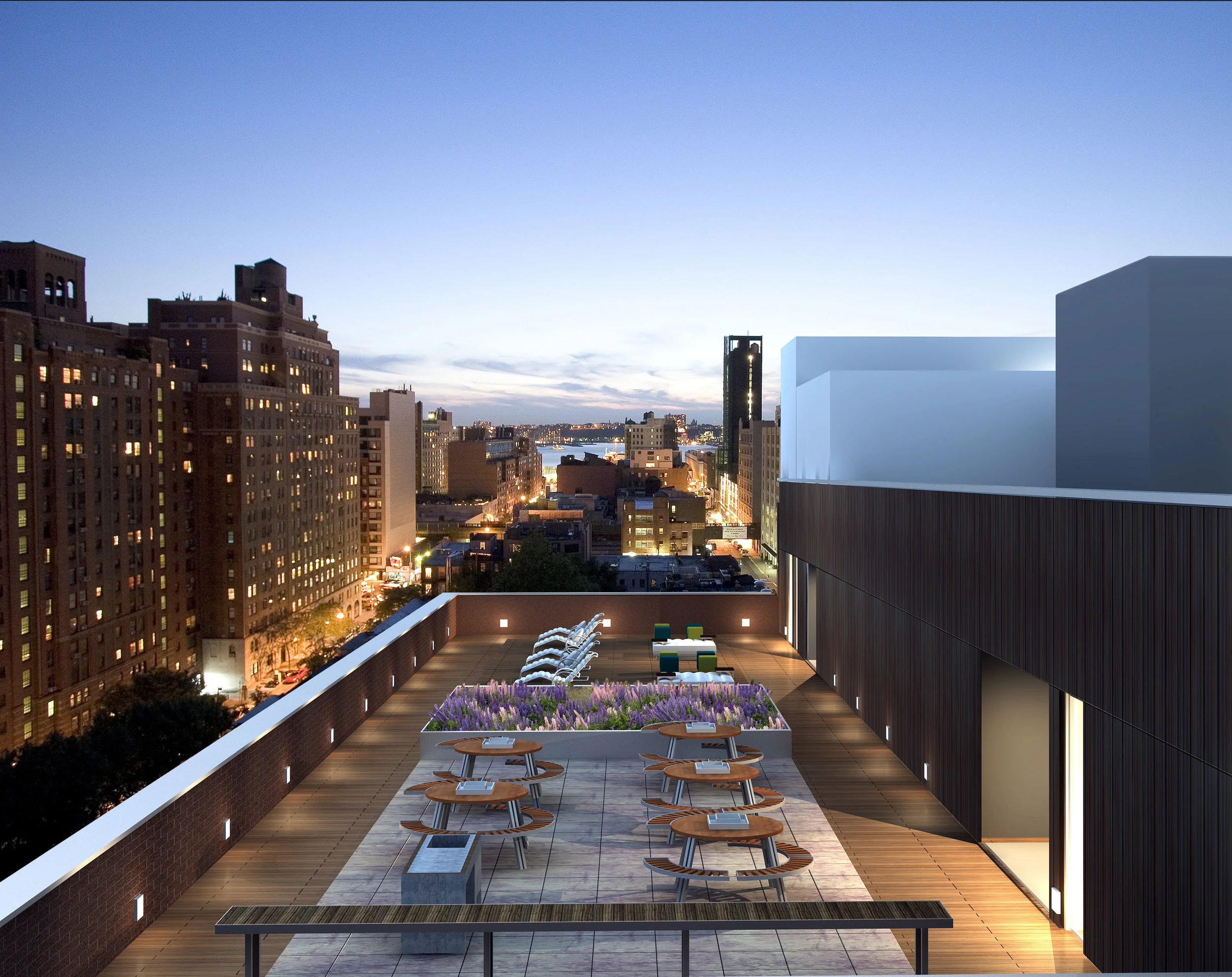
On the roof the wood deck is divided in two areas by a planted field of native grasses and wildflowers, species found on the Highline. The west “Day Deck” is animated by umbrellas, lounge chairs and cooled by outdoor showers. The east “Night Deck” is furnished with an outdoor bar, picnic tables, an outdoor grille and a fountain doubling as a beverage cooler. The deck area is surrounded by a running track, at once functional and voyeuristic.
IN THE NEWS
How do you marry a pre-war ink press building with an ultra-modern addition in a seamless way that complements the surrounding neighborhood? That was the challenge that TRA Studio Architecture faced with Loft25, a nine-story renovation + new build in Chelsea. The resulting 112,000-square-foot structure features 79 light-filled loft residences that blend together the best of old and new with stylish metal accents that are a funky as they are functional.
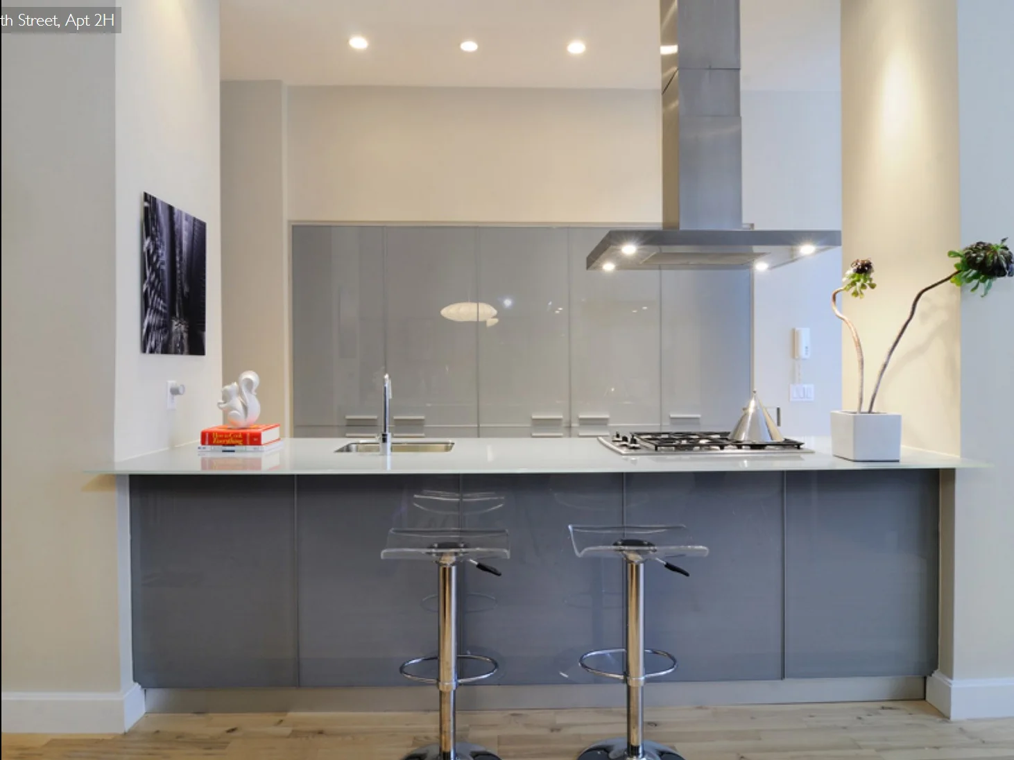
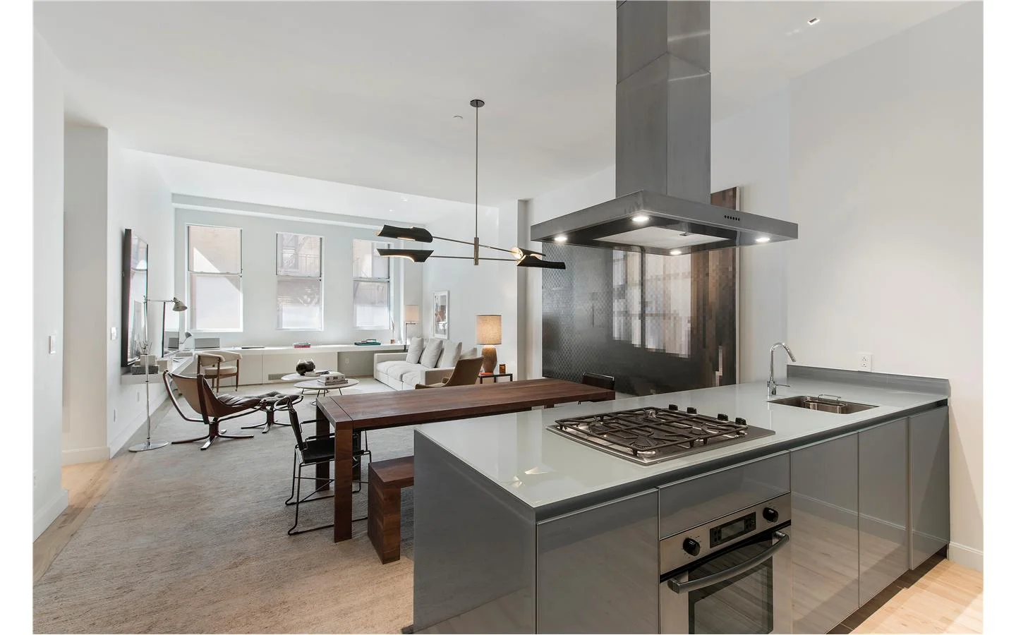
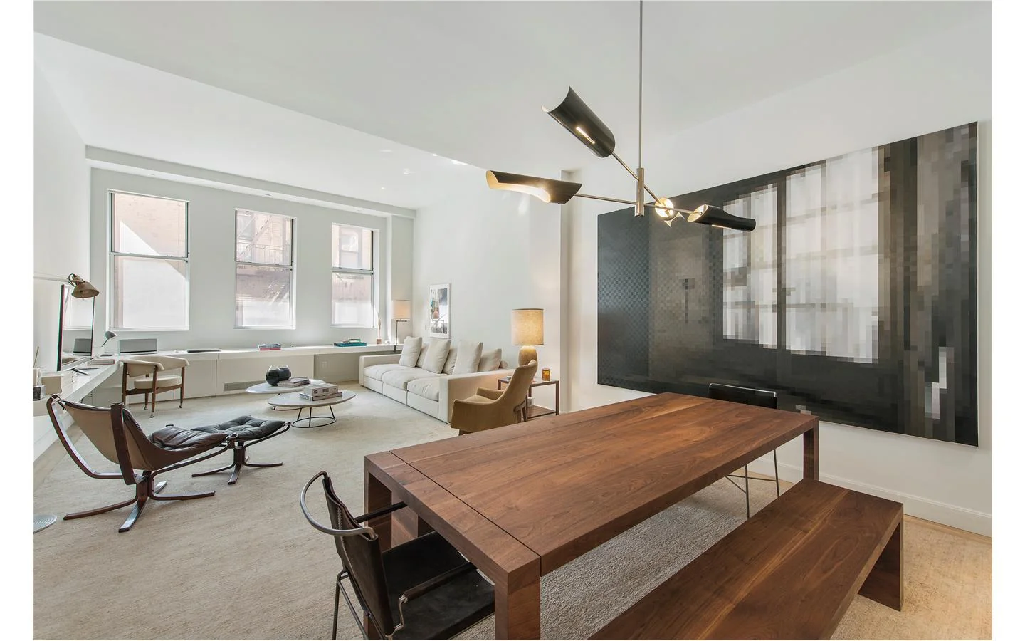
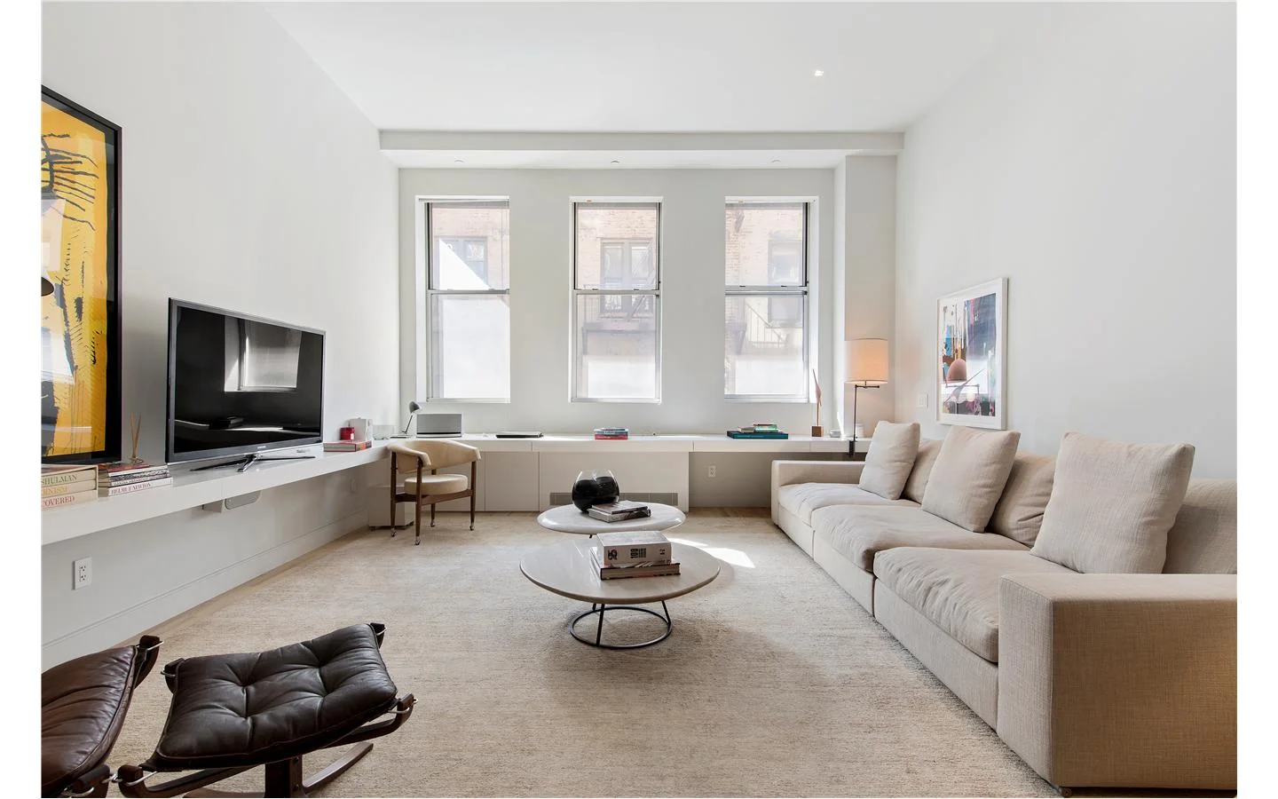
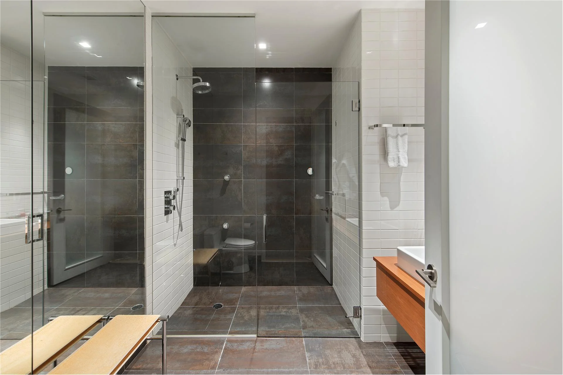
The design team’s solution for adjoining the seemingly very different facades was to stitch them together using stainless steel “eyebrows” that essentially staple the two buildings together while also creating visual movement and interest. Inside the loft apartments, 14-foot-high ceilings and large windows allow light to penetrate deep into the open floorplans. Designed with feng shui principles in mind, the elegant and minimalist interiors are characterized by light wood floors and a pale grey color palette that imbues residents with a feeling of Zen and serenity. Though simple in their lines, the kitchens and baths do impart a touch of luxury with their custom Italian cabinetry and fixtures by Schiffini and Nobili Spa.
Inhabbitat.com: Loft25 transforms an ink press into light-filled residences in Chelsea , by Yuka Yoneda, 03/08/16
Loft 25 is comprised of a previously existing building, and a new construction erected on the west side in 2006. The previously existing building is a prewar construction originally used as an ink press. The new building is seven storeys, and stands at half the height of the original building. The two buildings are tied thematically with extended stainless steel string courses, which project at slight angles from the façades.The new building contains the lobby, which features contemporary glass-work. The front of the new building is all glass. Architects from Traboscia Roiatti Studio designed the new building and integrated it with the old building. They have worked on other New York City projects such as 44 Mercer St, which demonstrate their ability to re-design and improve existing buildings, as well as their proficiency in use of glass to beautify exteriors.
Condopedia: Michael Gabrelsky, April 11 2013
“What better becomes, or freshens, an older masonry building than some stainless steel stringcourses and quoins and being a parent to a smaller modern building with a lot of shiny angularity? Such “cosmetics” might seem a bit showy, but will probably fit right in Chelsea .. The new building on the site is only about half the height of the older building, but the architects for the project, Traboscia Roiatti Studio, have tied the two buildings together thematically with extended stainless steel stringcourses that project at slight angles from the facades.”
Overlaps and alternating angles at Loft 25 in Chelsea. City Realty, Carter,September 06
LOFT25 Residences
The Feng-Shui philosophy that guided the building architecture also informed theinterior design. The lofts benefits from the generous floor height which informed the development slogan: living tall and from the varied and well equipped common spaces. The light mat wood flooring, glass concealed kitchens, pale grey and metallic bathroom tiles, all contribute to the light and airy feeling of the interiors.
Press:
Inhabitat.com: loft25-transforms-a-pre-war-ink-press-building-into-light-filled-residences-in-chelsea, by Yuka Yoneda, 03/08/16
http://www.condopedia.com/wiki/Loft_25
Overlaps and alternating angles at Loft 25 in Chelsea,City Realty, Carter,September 06
Condopedia: Loft 25, April 11 2013, by Michael Gabrelsky
https://www.ralcompanies.com/projects


