PEARL RIVER at Chelsea Market : the "friendship store"
redefining a brand by redefining retail
Location: Chelsea Market , NYC Size: 3,500 SF Type: Branded Environment, Retail and Community space
TRA studio’s Assistance : Architectural Design + Documentation, , Lighting, FFE, Branded Interiors, Branded Fixturing System, Architectural Signage
Pearl River Mart Chelsea
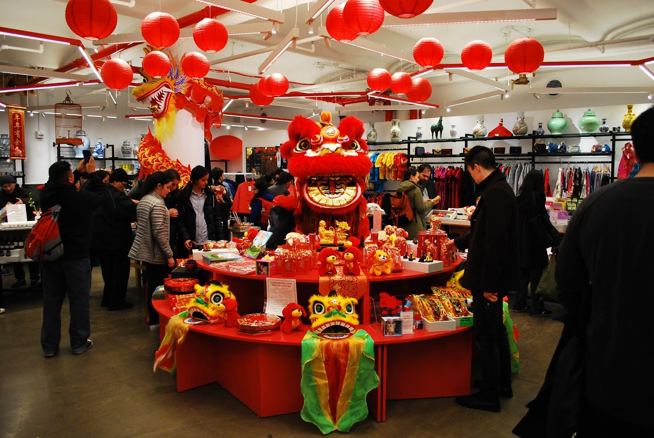
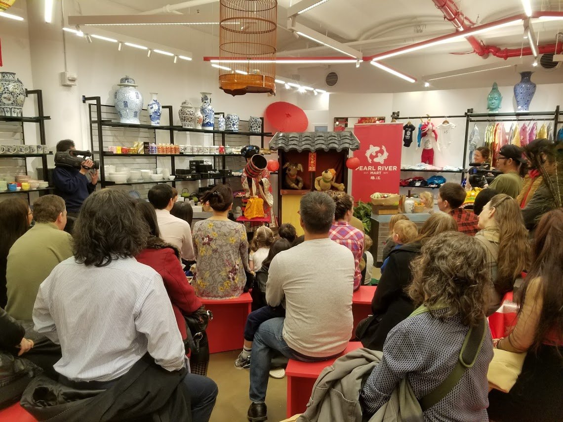
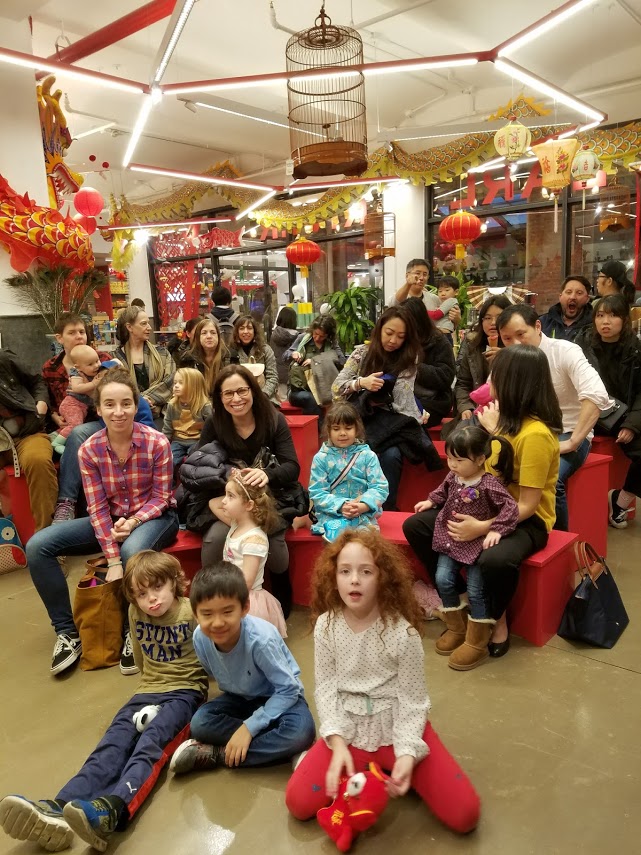
community events @ Pearl River Mart Chelsea
THE PEARL RIVER STORY & THE COLLABORATION WITH TRA STUDIO
Pearl River Mart started almost fifty years ago, when the relationships between the US and China, were non-existent, it was since the beginning a symbol of friendship between the two countries, an attitude which, during the years, evolved into a beloved neighborhood Institution. The store operated warehouse style for decades until Mr. Chen understood that he needed to define the brand. The educational aspiration of the brand identifies with a yearning for traditional values, authenticity, and stability and a desire to be part of and serve the Community.
The evolution of the PRM brand is the story of a collaboration that evolved over fifteen years, between the client, Pearl River Mart and the architect, TRA studio. The location of the PRM stores always responded to the Pearl’s tradition to consciously select architecturally interesting spaces in significant locations, making them available for use by the neighborhood. The store design functions as an extension of the public space.
The spaces we created together, two in SoHo, one in Tribeca and the most recent in Chelsea, are part of the Collective experience: most people who live or even just visited downtown NYC have a positive memory of one of the PRM stores, past or present, they are part of the collective memory and of the Collective well-being and inclusivity:
The two original SoHo stores, which occupied collectively 300000quare feet, spanned an entire block, during which he weekends the selling space functioned Intentionally as an interior street, they incorporated some of the wellness support spaces that are now an essential aspect of experiential retail: a quiet tea-room for workshops, iconic photo opportunities, meeting and performing places and even, included ample public restrooms.
The Tribeca Pop-up store, continued the Pearl tradition of reaching out to the Community, through the inclusion of an active Art Gallery, a spiritual wellness oasis, described in their blog, “a tribute to those who build bridges, understanding and joy”.
Finally the more recent store we designed in Chelsea, The Chelsea location continues Pearl’s tradition to a fresh storytelling approach to an old story, informs the design and celebrates the heritage and equity of the Institution, while remaining conscious of keeping the familiar connection with the old customers.
All the stores where designed with 100% RESILIENT recycled or recyclable materials, the demountable custom designed featuring system has been used over and over in the stores and still looks great today proving that RESILIENCY of good design is timeless and lasts, both literally and figuratively
PEARL RIVER @ THE CHELSEA MARKET
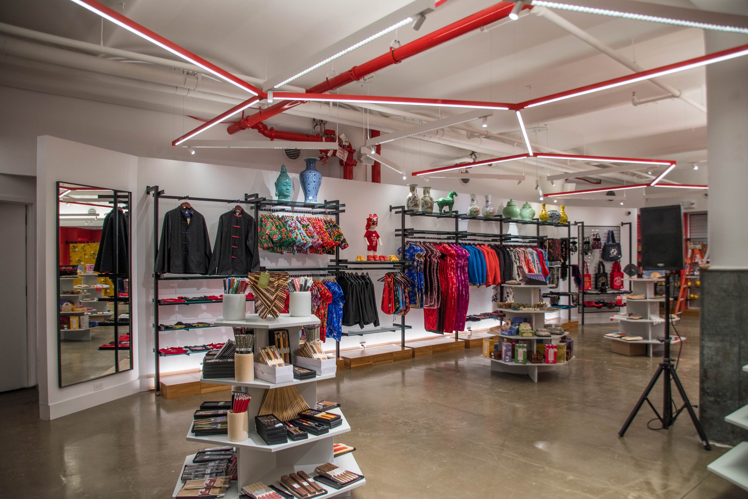
The evolution of the PRM brand can be followed in their history, the Chelsea store is the natural development of the previous ones: it still functions very much as an emporium and the political statement that inspired the original PRM is still the inspiration behind the experiential attitude of brand. The new store, which, reflecting the current retail downsizing is about 1/10th of the previous one, represents the prototype, the evolution of the PRM environment from “Mart” to “the Friendship Store”. The Chelsea location continues Pearl’s tradition to consciously select architecturally interesting spaces in significant locations, making them available for use by the neighborhood and drawing in turn inspiration from it, they always understood location matters, the design always drawing from the area.
A fresh storytelling approach to an old story, informs the design and celebrates the heritage and equity of the Institution, while remaining conscious of keeping the familiar connection with the old customers.
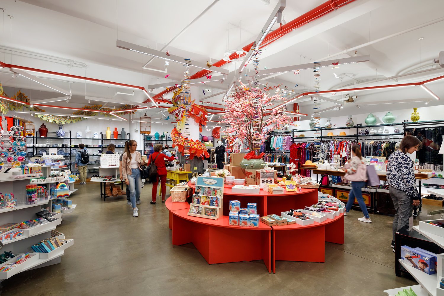
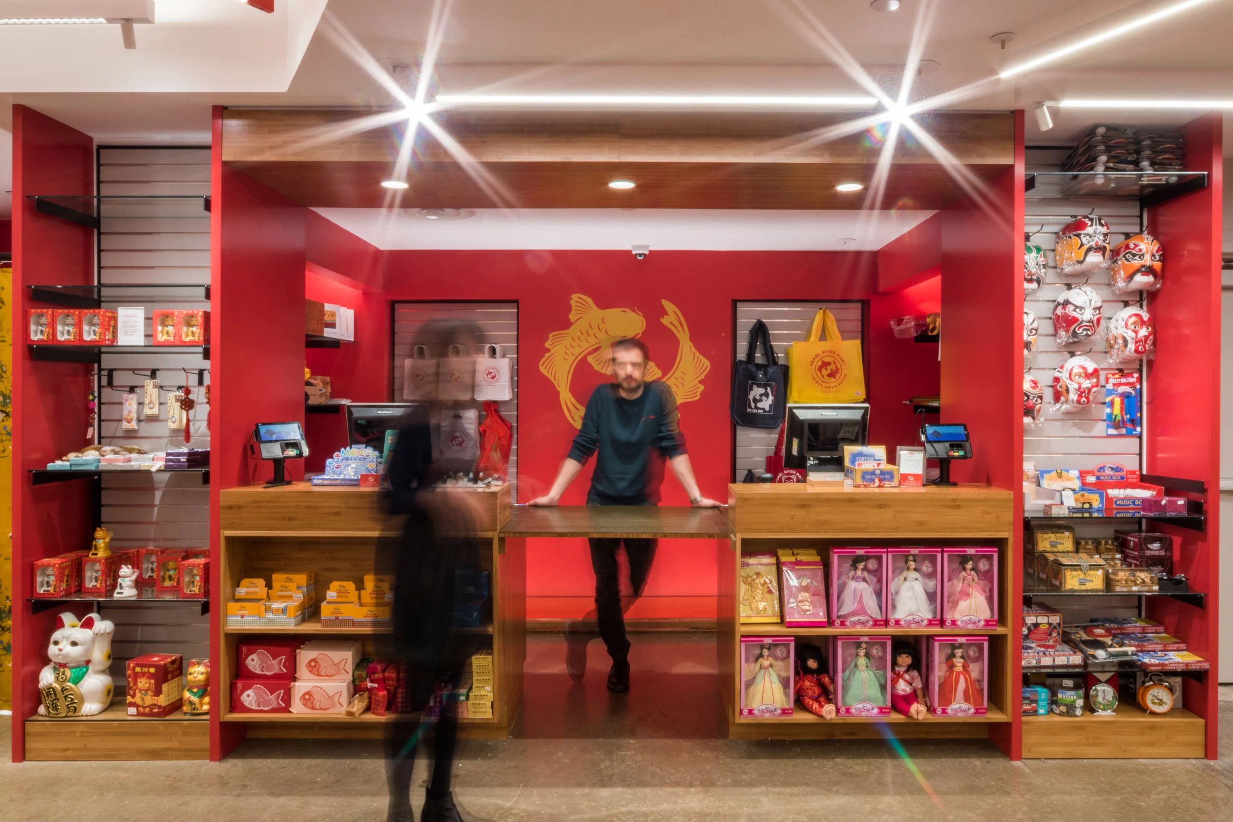
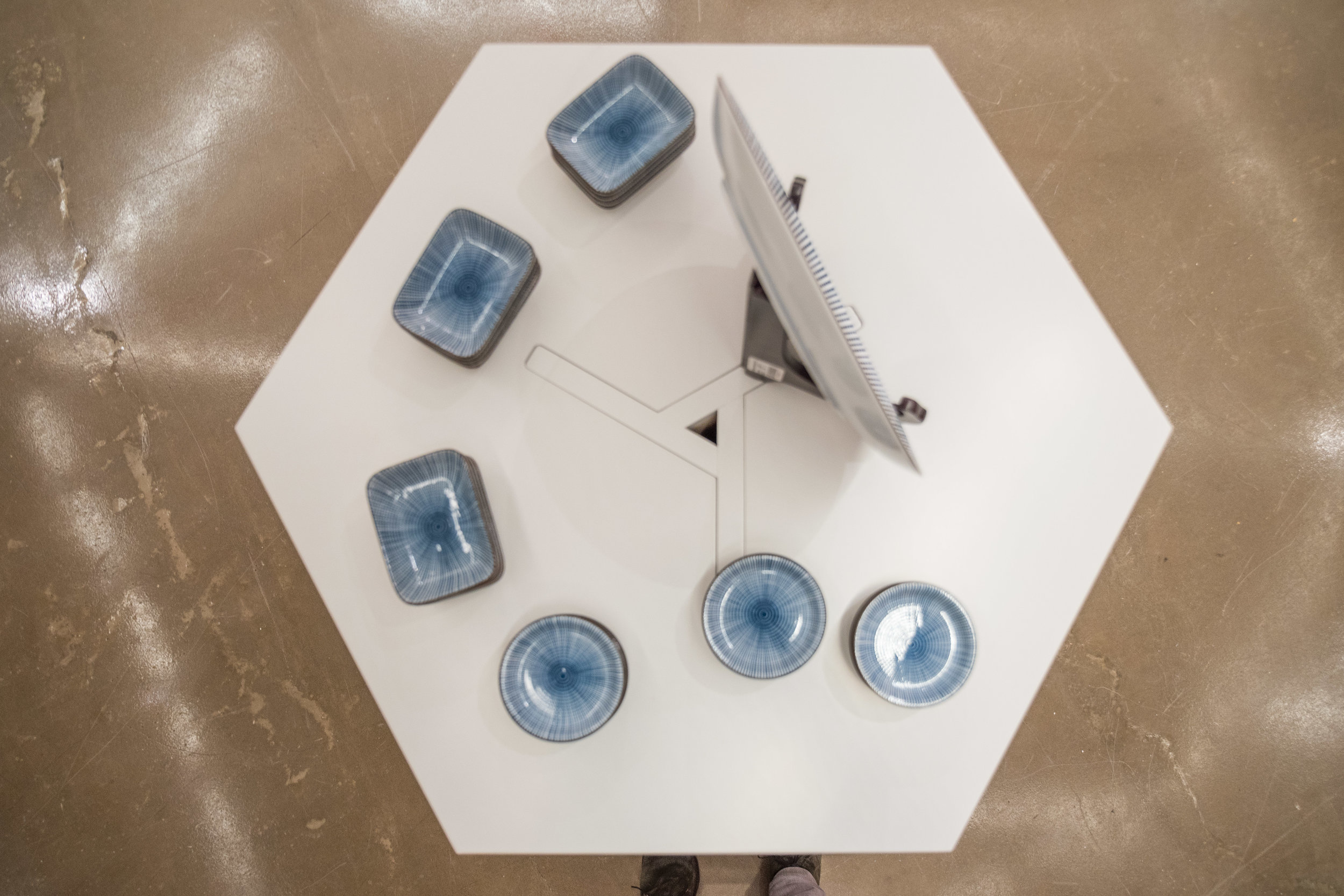
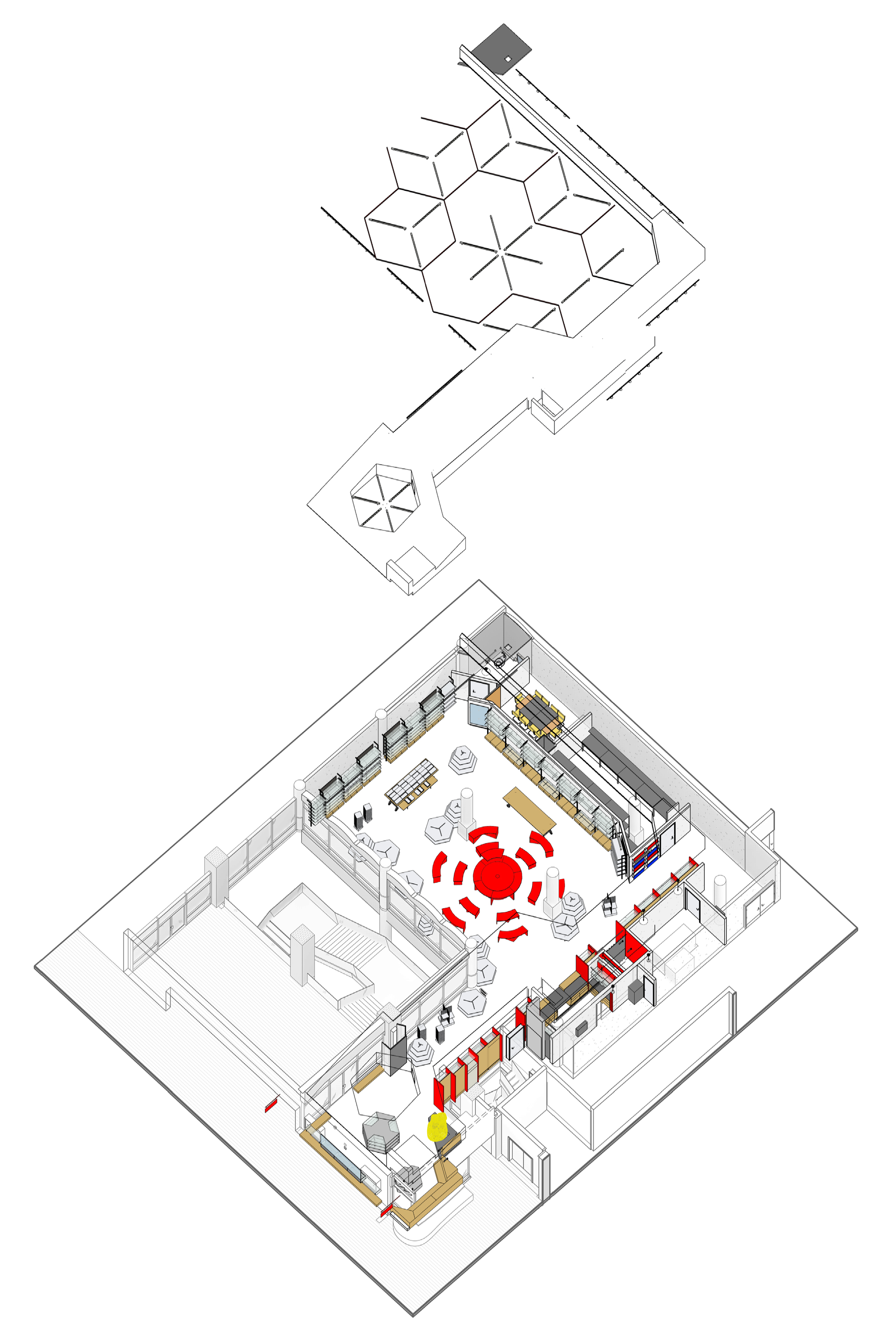
The educational aspiration of the brand identifies with a yearning for traditional values, authenticity, and stability and a desire to be part of and serve the Community. The space, although limited in size, allows for the dense display of the many items sold, all very varied in type and scale, but is also used as a warm gathering place for all sorts of amplified experiences, such as cultural events representing the Asian Community and beyond, from tea-serving ceremonies, to workshops, screenings, book signing and live performances and, simply, having fun perusing the merchandise, thru the sinuous artificial landscape created by the fixturing system. The large round table in the center serves as a tiered display, a lectern, a demonstration stand or expands its scale into a small amphitheater, creating an open court in the center. A similar hexagonal hub, also composed of movable units, marked by the same starburst chandelier above, houses the creations of guest designers. The adjacent flower display platforms also double as a seating area.
The lighting defines the spaces below, the superstructure of large hexagons creates an interlocking network of open canopies, where the different types of merchandise can find their place. The luminous aura is enhanced by the choice of the all-sustainable materials.
The rear fashion wall even hides a fully equipped private multi-functional room which can house a classroom presentation or a kid’s arts and crafts party.
Transformation is the essential tool to keep people coming back, the flexible , iconic and identifiable quality of the space makes the store a destination. The thoughtful, educational, fun, instagrammable, memorable, accessible public space and the transformational quality of the fixtures are not only essential to the success of this store, but also we believe, will become vital to the survival of retail in the city.
The design narrative developed naturally, but we could later recognize its roots in the Chinese iconography: the rice character, the red colonnade, the circular courtyard, the geometric latticework, the hexagonal pagoda, the river flowing through rising mountains in traditional paintings. Finding the references became a fun tool that justifies design decisions made instinctively.
News:
https://www.wsj.com/articles/nycs-pearl-river-mart-will-expand-to-chelsea-market-1505247390
https://therealdeal.com/2017/09/13/high-rents-forced-pearl-river-market-to-close-now-its-back-and-expanding/
https://therealdeal.com/2017/09/13/high-rents-forced-pearl-river-market-to-close-now-its-back-and-expanding/
https://www.timeout.com/newyork/blog/pearl-river-mart-is-opening-a-new-location-at-chelsea-market-this-fall-091317
https://www.dnainfo.com/new-york/20170913/chelsea/pearl-river-mart-chelsea-market-store-opening
https://ny.curbed.com/2017/9/13/16303864/pearl-river-mart-new-chelsea-market-location-nyc
http://chelseanow.com/2017/11/at-chelsea-market-pearl-river-mart-redefines-the-mom-and-pop-paradigm/
https://www.chelseamarket.com/directory-all/pearl-river-mart


