44 Mercer, SoHo Historic District, NYC
how to build a glass sliver building on top of four slender historic columns
44 Mercer SoHo Historic District, New York City Size: 7 Stories, 14,000 SF Type: New Mixed Use Building
TRA studio’s Assistance : Historical Research, Preservation, Architectural Design + Documentation, Interior Design, FFE, Lighting, Agengies’ Filing (LPC and BSA)
44 Mercer, SoHo, NYC
"in its neo-modernist probity, the new building is worthy to stand beside Jean Nouvel's, which is separated from it by a narrow courtyard that belongs to the Nouvel building” Above all else, perhaps, the chief charm of 44 Mercer is that it has not only been well designed but also well made”. James Gardner, The Real Deal
44 Mercer Street Building
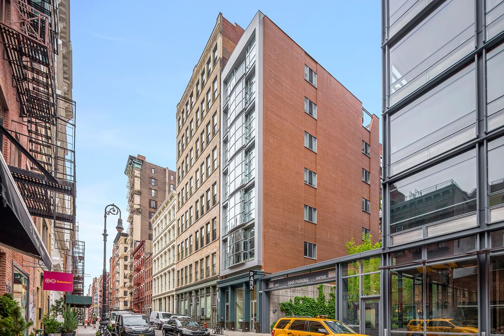
In the SoHo Cast Iron Historic District, three stories of an existing five- storey brick and cast-iron loft building were destroyed by a fire in the 1960’s. The surviving two-storey building had lost all of its architectural detail except for the ground floor cast iron columns, the preservation and reuse of which was pivotal in the Landmarks Preservation Commission’s decision to allow for a new building on this site.
The allowable built area required us to place a six-storey modern structure, or as requested by the client, 80 feet of glass curtain wall, atop the 20 foot high, ornate, structurally improbable columns.
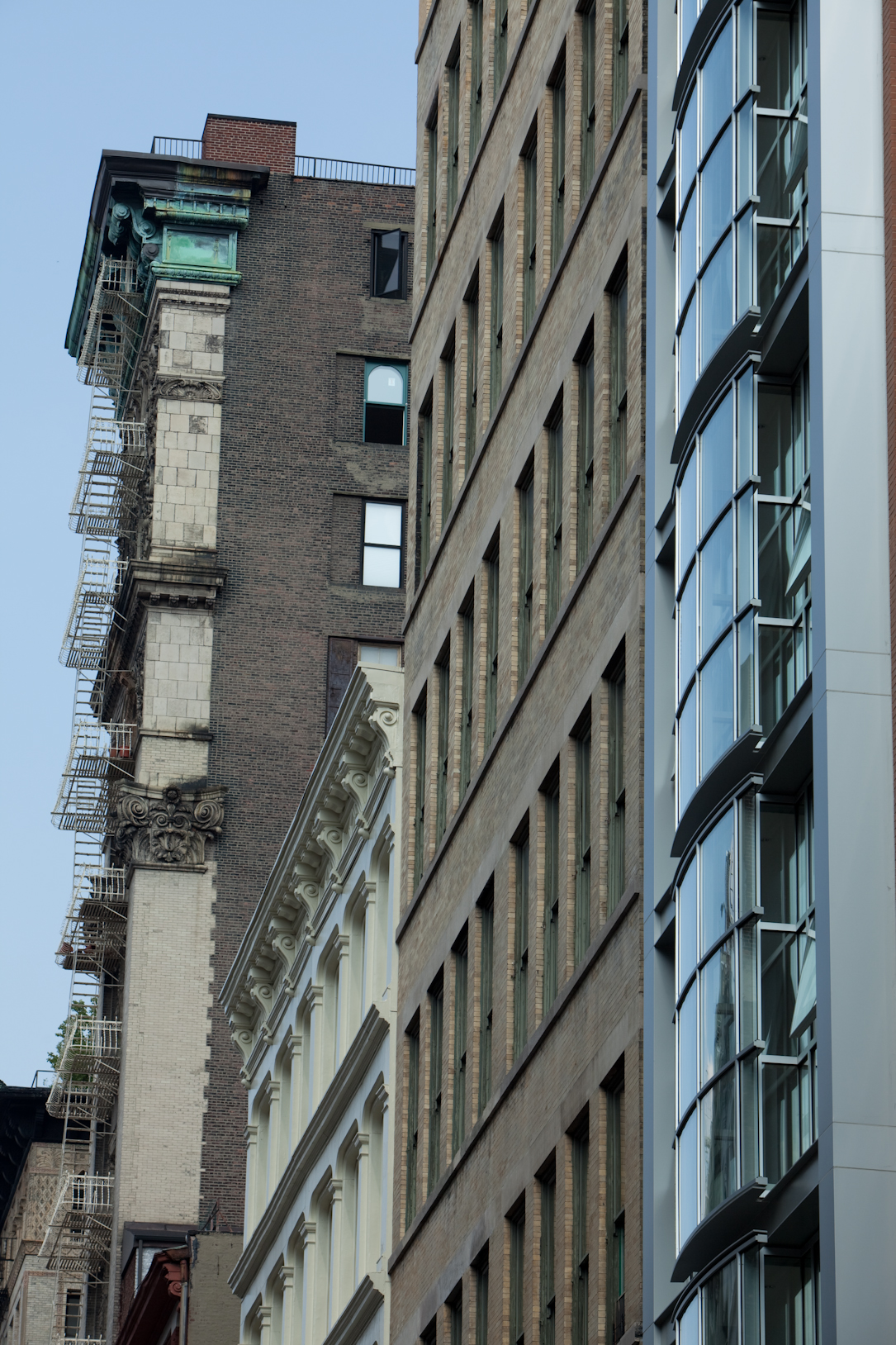
The task was difficult because the Community was at stake to loose a historic structure and because the two adjacent buildings, one historic and one very modern, are large in scale and could have made the slender structure easily look inappropriate.
The intervention had to be irreverent but respectful, looking backward and forward, familiar and new. The humble but crisp, aluminum panels, which TRA has used extensively for other projects, intentionally differ from both the the masonry and the cast-iron prevalent in the area, highlighting the contemporary, but contextual, aesthetic.
The Facade becomes the storyteller, it celebrates the context and its cultural hermitage. A glowing glass band links the existing and the new structure, pinned by the demising walls; a window/curtain hybrid, whose juxtaposition of the curtain wall fragment against the recessed operable windows recalls the layering of SoHo facades.
In order to make the building happen we partnered with LPC to reinterpret the zoning and codes. We petitioned to allow for the demolition of the existing structure, obtained a change of use variance and argued for the reduction of the rear yard at BSA, without which the loft apartments would have been too small. We obtained a variance for the sky exposure plane, without which the penthouse levels would have been all core.
In addition to these very pragmatic needs, since the small structure had stood out near its large neighbors and in order to make the tight residential units feel like lofts, backed by Landmarks, we obtained DOB reconsiderations for the ceiling height of the lower floors.
The client, asked for a modern floor to ceiling fenestration, to maximize the city views and for balconies, which are notoriously impossible to get approved in an historic district. The enclosed “balconies” respond to all these requirements and increase the allowable FAR. The curved glass wall is an inhabitable reactive layer, simultaneously connecting and separating the street from the private residence.
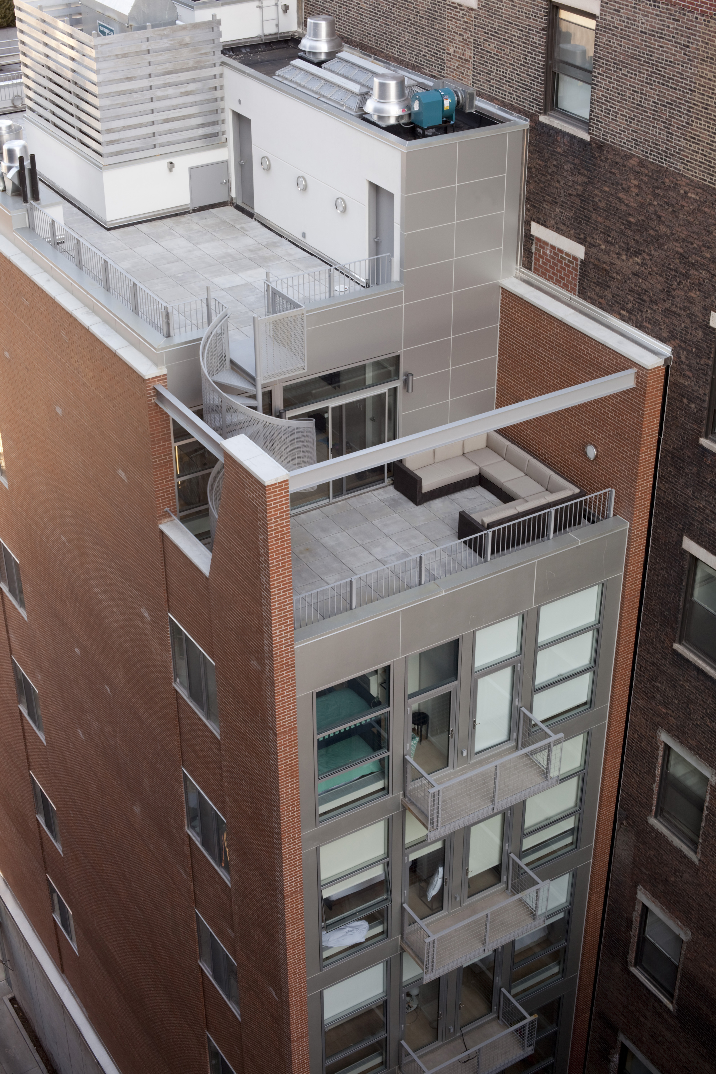
The installation of the thin steel spandrel, extending to support the oriel, was studied in various 3D animations to give the contractor an illustration of the assembly. The spandrel, which acts as an outrigger, follows the curved profile and corner supporting the main window wall, with very little tolerance. After the project was completed, confirming our intuitive strategy, we found a precedent in a cast-iron building nearby with a curved fire-escape.
The rear façade and side facades, both visible from the public way, have been designed as carefully as the front façade. TRA also designed the lobby and residential units interiors.
The intervention preserves the remnants of the historic structure while restoring the Mercer Street character with its large scale utilitarian buildings. It completes “the making of the street," from an utilitarian and gritty townscape, to one of the most recognizable streets in SoHo. TRA contributed to the streetscape transformation with 72 Mercer, 52 Mercer, 22 Mercer and finally 44 Mercer.
44 Mercer, Loft Residences
TRA designed the new eight-stories building as well as the interior of the apartments. The facade finds balance between the architecture of the surrounding buildings and the contemporary insertion. Similarly, the interior builds on all of the attributes that make the old loft apartments desirable, within a modern and efficient interior.
The curtain wall, as in all of TRA's new buildings, is the main architectural element, both on the outside as well as from the inside. The projecting bay-window allows for diagonal views and also provides a sense of privacy.
The light maple floor adds to the airiness of the space. The generous ceiling height is enhanced by the lighting, also designed by TRA. A large Bulthaup kitchen, clad in a metallic bronze reminiscent of the industrial materials typical of the area, and clean bathrooms complete the interior.
TRA studio was responsible for the interior architecture of the apartments, including all finishes, lighting, kitchen, bathrooms and built-in cabinetry, (furniture selection by owners).
THE CATALYTIC EFFECT: THE DOWNTOWN PROJECTS
The studio’s numerous projects in Downtown Manhattan have all played a spin off role in enhancing their respective neighborhoods and all have given back with overarching citywide importance, each intervention adding to a catalytic reaction at urban scale.
The numerous interventions along Mercer Street, and more recently in the Tribeca area South of Canal, contributed to the “making of the street”, acting as anchors in the commercial SoHo District and the lower Broadway corridor.
44 Mercer, Penthouse Residence
Fulfilling the modernist promise of integration between interior and exterior, TRA designed the new eight-storey building as well as the interior of the apartments. The interior is designed and built with the same care of the exterior, like the facade finds balance between the architecture of the surrounding buildings and the contemporary insertion, similarly the interior builds on all the attributes that make the old loft apartments desirable, within a modern, efficient interior.
The curtain wall, as in all of TRA's new buildings, is the main architectural element, both on the outside as well as from the inside, the recessed balcony allows for diagonal views as well as provides a sense of privacy.
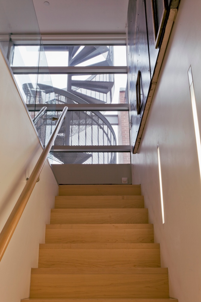
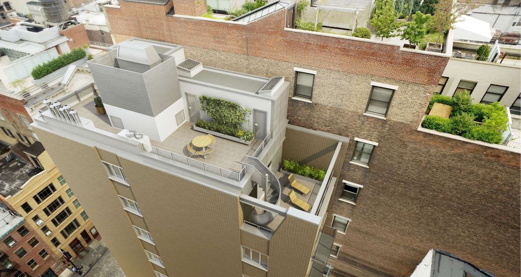
The rear curtain wall opens onto a private deck, sort of an artificial landscape semi-enclosed by a brick wall with an abstract cutout looking at the Nouvel building and animated by a sculptural spiral stair that access the upper deck.
The light maple floor adds to the airiness of the space, the generous ceiling height is enhanced by the lighting,also by TRA. A large Bulthaup kitchen, clad in a metallic bronze reminiscent of the industrial materials typical of the area, and clean bathrooms complete the interior.
Press:
White, Willensky, 17th AIA Guide to New York City, Leadon, Oxford Press 2010, page 120
A success due to sober design, skillful construction, James, Gardner,November 5 2009, The Real Deal
AIA New York and AIA National, AIA Cities Field Trip, audio recordings guide
Breaking up not hard to do at 44 Mercer, by Pete Davis, curbed.com, April 23, 2009
Historic Preservation faces Sustainability issues, eOculus, by Jessica Sheridan,07/2008


