Pearl River Mart Department Store, SoHo, NYC
how good design can make sense of the chaos of a Chinese Emporium
SoHo Historic District, NYC Size: First floor and Cellar:20,000 SF, 2002 2 FL Expansion: 10,000 SF, 2006-09 Type: Branded Environment, Chinese Dep. Store Photography: Luca Vignelli, Reven Wurman
TRA studio’s Assistance : Historical Research, Preservation, Architectural Design + Documentation, Lighting, FFE, Branded Interiors, Branded Fixturing System, Architectural Signage, Project Management
Tra Studio designed the new storefronts for both the Broadway and the Mercer street facades for the 30,000 square feet Pearl river branded Environment, as well as the Store Manual and fixturing System
Pearl River Mart Broadway
When Mr. Chen approached us, we were somewhat surprised. Pearl River was an “ad-hoc” built environment, very different from the modernist aesthetic we professed, but his statement that “the container does not need to be traditional or even oriental, the product is” won us to the project.
The new look, as requested by the client, is at “the threshold of” and maintains the mix of sophistication, order, eclectic chaos, simplicity, tradition and contemporary sensibility. It is the universal and truly oriental, inexpensive and luxurious mixture that made the store famous.
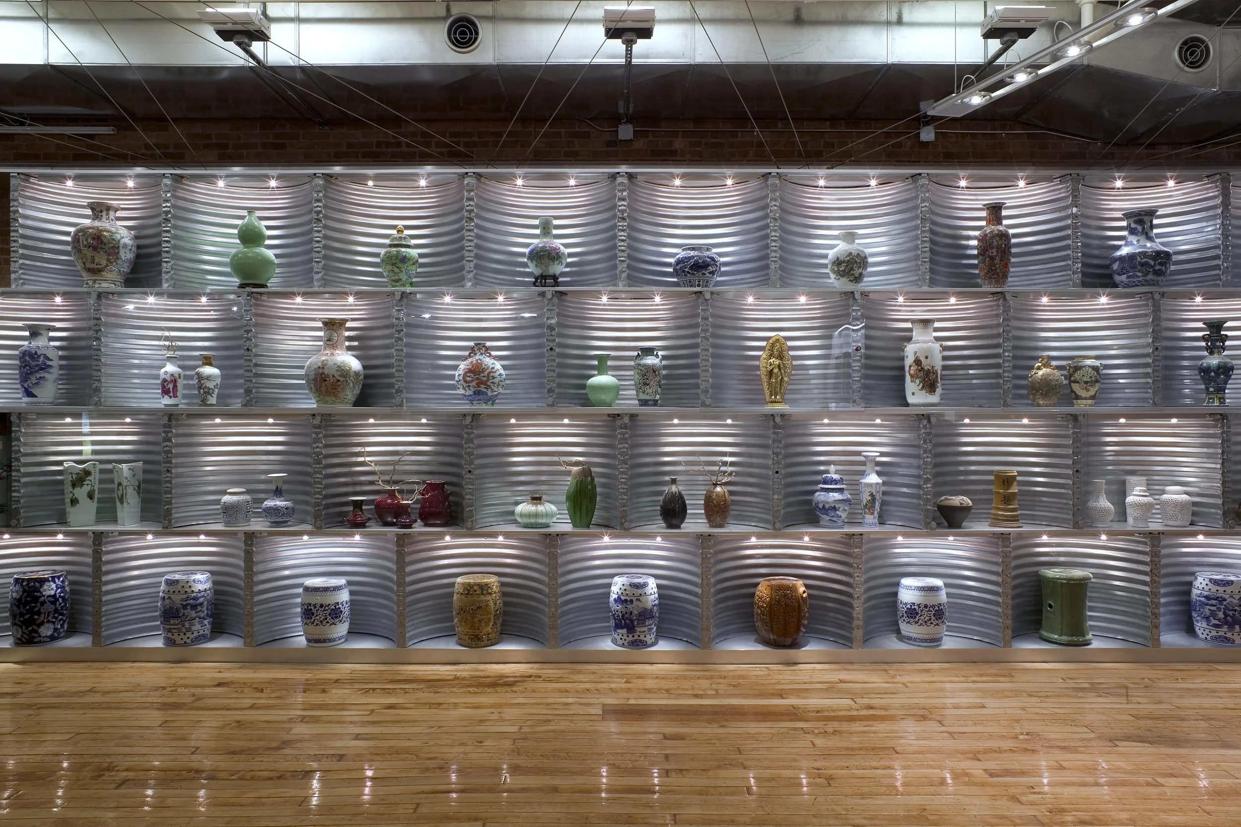
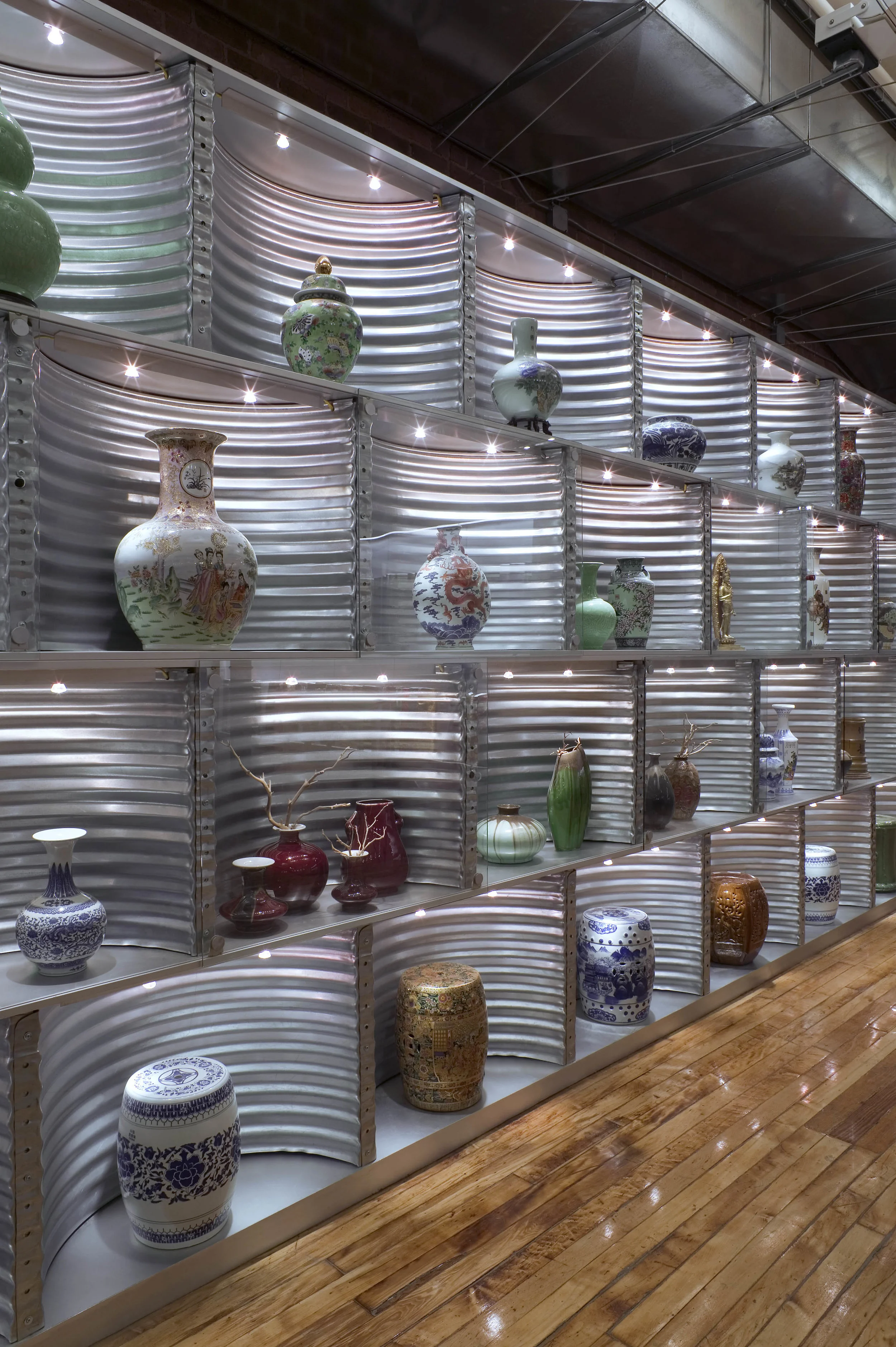
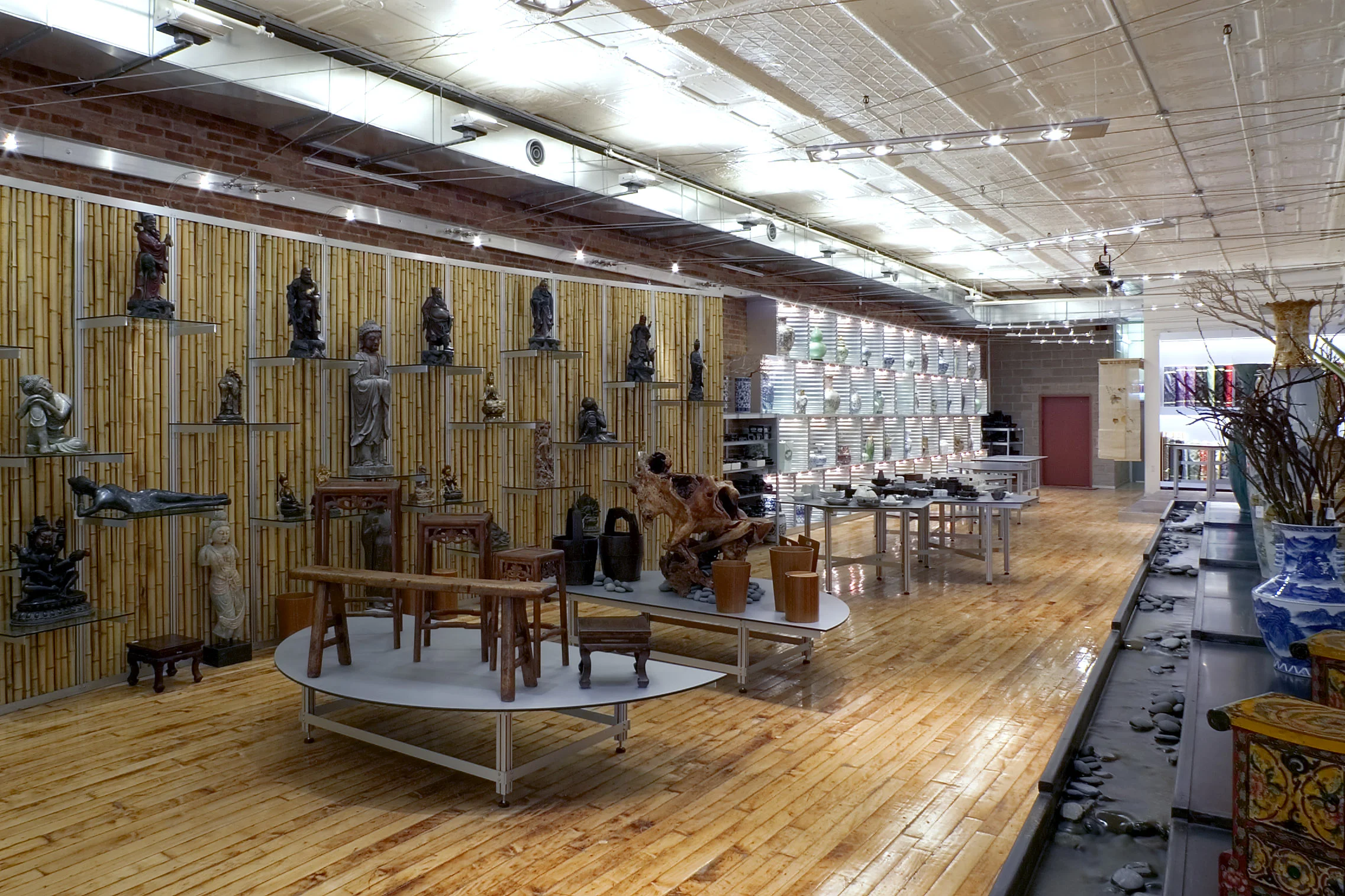
The two lower floors are designed employing the economy of few architectural elements. The merchandise is situated around interior courts similar to the Chinese Courtyard Houses, marked by large scale portal elements. The easy to navigate plan is mirrored on the ceiling pattern, the fixtures color-coding the departments.
The mezzanine teahouse is curiously a calming and quiet oasis in the building store. The waterfall made of metal panels modeled after Chinese roof shingles provides the background sound of nature. The landing of the new stair on which it sits is comfortable enough to stop and enjoy.
The Pearl River Mart expansion to the second floor faced us with several immediate challenges. Mr.Chen required a high degree of flexibility due to the unpredictable nature of the product displayed. The new floor needed to be at once visually connected but physically separated from the main floor, the new floor access being through the public building lobby and stair, both in need of complete reconstruction.
Interpreting the new storefront design was a critical part of the store design. The solution hinged on the redesign of the dramatic three-storey high building lobby where a 30 foot high fire rated glass slot visually connects the main and new selling floors.
The visitor is transported to his destination by the circulation path which, like a river flowing between its banks, connects a series of large abstract shapes. The platforms, simultaneously acting as viewing platforms and performance spaces, are intimate enough to display domestic furnishings.
The lighting system wire support has been designed to satisfy the technical needs while completely revealing the integrity of the historical envelope. The industrial loft aesthetic is reinforced by the use of exterior grade “green materials” for the fabrication of the fixtures: Trespa panels, commonly used for building siding, roofing concrete planks, aluminum, steel “tiles”, exposed brick, bamboo and steel light-wells retaining walls for the vitrines.
THE PEARL RIVER STORY & THE COLLABORATION WITH TRA STUDIO
Pearl River Mart started almost fifty years ago, when the relationships between the US and China, were non-existent, it was since the beginning a symbol of friendship between the two countries, an attitude which, during the years, evolved into a beloved neighborhood Institution. The store operated warehouse style for decades until Mr. Chen understood that he needed to define the brand. The educational aspiration of the brand identifies with a yearning for traditional values, authenticity, and stability and a desire to be part of and serve the Community.
The evolution of the PRM brand is the story of a collaboration that evolved over fifteen years, between the client, Pearl River Mart and the architect, TRA studio. The location of the PRM stores always responded to the Pearl’s tradition to consciously select architecturally interesting spaces in significant locations, making them available for use by the neighborhood. The store design functions as an extension of the public space.
The spaces we created together, two in SoHo, one in Tribeca and the most recent in Chelsea, are part of the Collective experience: most people who live or even just visited downtown NYC have a positive memory of one of the PRM stores, past or present, they are part of the collective memory and of the Collective well-being and inclusivity:
The two original SoHo stores, which occupied collectively 300000quare feet, spanned an entire block, during which he weekends the selling space functioned Intentionally as an interior street, they incorporated some of the wellness support spaces that are now an essential aspect of experiential retail: a quiet tea-room for workshops, iconic photo opportunities, meeting and performing places and even, included ample public restrooms.
The Tribeca Pop-up store, continued the Pearl tradition of reaching out to the Community, through the inclusion of an active Art Gallery, a spiritual wellness oasis, described in their blog, “a tribute to those who build bridges, understanding and joy”.
Finally the more recent store we designed in Chelsea, The Chelsea location continues Pearl’s tradition to a fresh storytelling approach to an old story, informs the design and celebrates the heritage and equity of the Institution, while remaining conscious of keeping the familiar connection with the old customers.
All the stores where designed with 100% RESILIENT recycled or recyclable materials, the demountable custom designed featuring system has been used over and over in the stores and still looks great today proving that RESILIENCY of good design is timeless and lasts, both literally and figuratively
Press:
Robert Traboscia, Parsons RE:D, May 2005
New York shopping destinations, Roxanna Swey, DDI Magazine, December 2003
New York Times, September, 2003
Pearl River changes its course, Marianne Rohrich, March 6, 2003, New York Times
The Asian Attraction, Gareth Fenley, Design Display and Ideas Magazine, July, 2003
Move to SoHo uncramps Chinatown store’s style, Pearl river’s success flows through design, Crain’s, Lisa Fickensher, October2003
New York Shopping Destinations, Design Display and Ideas Magazine, Roxanna Swey, December 2003
“New Yorker’s secret font of affordable Asian goods now has a SoHo address. Housewares and fashions are on the well-designed first floor”, The new York list,Melissa Feldman, June 2003
Paper Magazine, May 2003
New York Times, March 2003
New York Magazine, February 2003
CultureNOW,DowntownNOW
AIA Architectural Tourism Committee, Mercer Street walking tour 2011
www.Rakks.com
www.Trespa.com


